<kbd></kbd>
I don't speak/read any of these languages, so I'd like to have some feedback and answers to a few questions from people who do.
If you have some interest and a bit of taste for what is good typography in your language, I'd be grateful if you can answer (some of) them (and tell which language you're speaking for).
Some abbreviations:
CJK = Chinese, Japanese, Korean.
SC = Simplified Chinese (China)
TC = Traditional Chinese (Hong Kong, Taiwan)
JA = Japanese
KO = Korean
This is about our **HTML/EPUB rendering**, and **horizontal layout only** (sorry for vertical text lovers :)
I want to cleanup the text formatting code of our EPUB rendering engine, possibly getting rid of our current hanging/floating punctuation code (that is problematic, see #2844 - but it was made for CJK, see https://github.com/koreader/koreader/issues/2844#issuecomment-464493642) to eventually introduce optical margin alignment, while still may be handling what's needed for CJK).
In the process, I'd like to know what's needed for better text layout, typesetting, typography for Chinese, Japanese and Korean.
We have a few issues (#6078), and I have read the Google translation of https://www.thetype.com/kongque/, and it looks like we're far from being good :)
I don't plan to really rewrite the whole thing, but I believe there might be already enough hooks available in the text layout code that we could use more intelligently, and doing a bit better might be not too much work.
Below, I've put some pictures from that typography site, just for illustration purpose: when they show multiple options, if you have strong feelings about preferable and bad options, in your language, feel free to tell and comment on them.
So, the questions (no need to quote in your answer, just mention the question letter in bold when replying):
**A**: what language do you usually read, and which others you know (among SC, TC, JA and KO)?
**B**: how would you rate, on a scale of 1 to 10, the current rendering output of KOReader?
**C**: is it good enough? For you - and is it for most casual readers? How does it compare to other book reading applications? Can we do better? _Should_ we do better? How doing better (according to typography reference text) would be welcome by current readers: like an improvement? or like some old bothering rules that no one really care about in 2020?
#### Traditional Chinese vs Simplified Chinese
I got a grasp of what's expected for Simplified Chinese (SC) from https://www.thetype.com/kongque/ . I'd like to know a bit more of what's expected for Traditional Chinese (TC), and how much TC typography and needs differ. (@cges30901 , may be you can answer that?)
**D**: are SC and TC actually the same language, and just the writting differ ? I get TC might have additional glyphs that SC readers might not be used to, is that right? So, are TC readers able to read SC without any issue, or the change in typography (glyphs, punctuation) is something that make it not natural?
Looking at the screenshots from https://github.com/koreader/crengine/issues/307#issuecomment-629619680, where some SC text is rendered with SC and TC typography (meaning it uses the TC glyphs, centered punctuations and may be slightly different gylphs), is it still readable in both renderings - and is that change of applying TC typography enough to make it more readable and confortable?
I get SC got some new punctuations and punctuations rules (inherited from western typography?) and that a good amount of SC typography job is to handle forbidden line breaking around such punctuations, while trying to ensure justified text alignment and the eastern "grid" (squared glyphs in their grid squared slot).
Lots about that in https://www.thetype.com/2018/05/14501/ - [[English translation]](http://translate.google.com/translate?u=https://www.thetype.com/2018/05/14501/&hl=en&langpair=auto|en&tbb=1&ie=UTF-8)
**E**: how is that with TC? The above URL shows a scan of a Taiwanese book where no care is taken about punctuation, which can happen at start of line - but the grid is perfect:
<img src="https://user-images.githubusercontent.com/24273478/82214766-9b2d7800-9916-11ea-97c7-2e186f2ef052.jpg" width=300/>
Is that really what TC readers want/expect? Really nothing more to do than stacking glyphs and never do any width adjustment or line breaking care? I think KOReader currently does some line breaking care - should it stop doing that when typography is set to Traditional Chinese?
Or is that some "old" book, and TC nowadays expect a bit more, by being influenced by western or SC via the internet and how web browsers do it?
#### The east asian paper grid
> some people very much admire the Chinese grid with "horizontal and vertical alignment". But obviously, there is a contradiction between avoiding the head and tail and the traditional Chinese grid, which must be adjusted and chosen
>
**F**: how much SC, TC, JA and KO care about the grid and perfect grid fitting?
<img src="https://www.thetype.com/wp-content/uploads/2017/06/Unit.png" width=300/> Perfect fit
<img src="https://www.thetype.com/wp-content/uploads/2017/06/justifiedgrid.png" width=300/> Not perfect
Currently with KOReader, because of text-indent of the first line, text justification, and the non-justification of the last line, because of our margins, or the introduction of western letter or numbers in the text, it must easily/always be broken.
How important is it to fix that?
https://www.thetype.com/2017/07/12513/ [[English translation]](http://translate.google.com/translate?u=https://www.thetype.com/2017/07/12513//&hl=en&langpair=auto|en&tbb=1&ie=UTF-8) says the first typographic rule should be:
> The line length of a line should be an integer multiple of the font size
> [me: meaning, a multiple of the full-width ideograph width, so they can be stacked closely and they would meet the right margin without gap, and there's no need to add space in between for text justification]
**F1**: so, for SC/TC/JA/KO typography, when formatting a paragraph of say 210px (because of your KOReader margin choices, or the HTML container has a width specified via CSS), and the (main) font size is 20px, should we force the formatted paragraph width to be reduced to 200px (so 10 glyphs fit exactly instead of 10.5, which would require to distribute 1px to each of the 10 glyphs to reach 210px) ?
**F2**: if yes, how should this 200px formatted paragraph be aligned in its 210 px container? Left, centered? Imagine that it might be followed by another paragraph with a smaller or larger font size, and their left and right edge would then no more align: what's preferable?
**F3**: then I guess that for the first line of a paragraph, if it has some text-indent, that text-indent should be also rounded to an integer multiple of 1em (1x font size). In our epub.css, we use a `text-indent: 1.2em`, which will induce some shift on the first line. I see the chinese book I used in https://github.com/koreader/crengine/issues/307#issuecomment-629619680 has it set to 2em. Should our 1.2em be rounded to 1em or 2em when CJK typography is applied ?
**F4**: is the natural stacking (without interspace) of glyphs good for everybody? Or do some readers prefer to have some additional spacing (In a comment on these pages, someone says he prefers justification which add some spacing, otherwise, it's too condensed and he gets tired quicker)? Currently, our justification might provide that. Our bottom pannel toggle "Word Spacing" has no effect with CJK, as it only deals with the "space" character, that CJK text must not have (except may be Korean?)
**F5**: how this grid fitting should work when, inside a paragraph, the text has some different font sizes. Can we assume that generally does not happen, and not care much about the result when this happens?
#### Head and tail avoidance / punctuation at start or end of line rules
I read SC and JA do have some punctuation/parenthesis/quotes forbidden at start of line, and some others forbidden at end of line (still unsure about TC, see question E - no idea yet about Korean).
When trying to ensure that, we might end up having some lines with fewer ideographs than the line allows. When text is left aligned, I guess this is not an issue, but when text is justified, we need to distribute the remaining space inside the line, to have the last glyph reach and get stuck to the right margin.
https://www.thetype.com/2018/05/14501/ - [[English translation]](http://translate.google.com/translate?u=https://www.thetype.com/2018/05/14501/&hl=en&langpair=auto|en&tbb=1&ie=UTF-8)
The good thing is that since mid april 2020, KOReader/crengine uses libunibreak for line breaking following https://unicode.org/reports/tr14/, which hopefully does the right thing, so we don't need to code this forbidden punctuation detection. But we need to have a strategy for the extra width distribution, or the "squeezing" of some punctuation glyphs when pulling additional glyphs to avoid some bad line ending or next line starting - or what can be expanded when we can't do that.
That article has a very interesting section: "[How to avoid head and tail: Methodology](https://www.thetype.com/2018/05/14501/#ProhibitRule-method)", that details various strategies.
<img src="https://www.thetype.com/wp-content/uploads/2018/04/bitouwei-jijin2.png" width=300/> <img src="https://www.thetype.com/wp-content/uploads/2018/04/bitouwei-tuichu1.png" width=300/>
This article too: https://www.thetype.com/2018/02/14211/ - [[English translation]](http://translate.google.com/translate?u=https://www.thetype.com/2018/02/14211/&hl=en&langpair=auto|en&tbb=1&ie=UTF-8) "Full-width and half-width" (we, in koreader/crengine, would be working with mode B)
<img src="https://www.thetype.com/wp-content/uploads/2018/02/Mode-Explaination.png" width=400/>
Some of these strategies might be easier than others to implement, dunno yet.
**G1**: These articles describe what might be done for SC. Do these strategies make sense in TC, JA or KO ?
**G2**: Some of these strategies reduce the width of some punctuation from full to half, so, possibly breaking the grid and shifting some glyphs by 1/2, making them in the middle of 2 squares. How is that acceptable? Is it still better than having variable shifts of glyphs, like we currently do? Or once there is that and the grid is broken, it's really not worse having free positionning?
**G3**: it is mentionned a strategy that allows to make comma and quotation half-width, but the period (end of sentence) should be kept fullwidth. Is that requested for TC, JA, KO? Should we catagorize punctuations that are allowed to be half-width and those that shouldn't?
**G4**: it is mentionned a requirement that "punctuation marks that happen at the end of a line, if they are full-width characters, they should occupy the width of half-width characters (that is, half-word positions) to make the visual effect more beautiful". So, a full width period at end of line should be halfwidth and touch the right margin. In the same way, I guess an opening ` <` or ` (`at start of line should also be half-width, getting rid of the space on the left of the glyph. How is that required in SC/TC/JA/KO ?
**G5**: when having 3 commas in a line, would it be ok to have 2 of them half-width, and keeping one full-width? Ot it's better to try to balance them by having the 3 commans all reduced by the same amount of 2/3 ?
**G6**: so, there are full-width glyphs (square), and half-width glyphs (half a square) in Unicode. Do books and documents only use the full-width glyphs? and half-width are just there as a tool for justification/layout - or do some documents really use half-width glyphs in their sources?
As seen on the screenshots of https://github.com/koreader/crengine/issues/307#issuecomment-629619680, SC gets all their closing punctuation shifted on the left or their square, JA gets that for comma and periods (but not question mark), TC gets all of them centered in their square.
<kbd>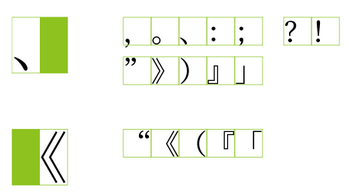</kbd> SC punctuation (shifted on some side)
<kbd></kbd> TC punctuation (centered in its square)
JA has a mix of these.
**G7**: is half-width reduction (or any width reduction) allowed when the punctuation is centered? If yes, should it stay centered, or can we have it shifted to the left (so, nearer to what it's closing)?
**G8**: technical question: if reducing/repositionning such glyphs, it might be hard for the code to know if the comma or period is left or centered in its glyph, and how to cut/position it. We might get some help from the font OpenType features, like:
https://helpx.adobe.com/fonts/using/open-type-syntax.html#halt
https://docs.microsoft.com/fr-fr/typography/opentype/spec/features_fj#halt
Do you think the CJK fonts you are using have sufficient such features (the NotoSansCJK we ship have them)? Can we rely on expecting/requiring fonts to have them (and have bad results, glyphs overriding each other, when using non-capable fonts) ? Or do you use/love other/older fonts that might not have them?
Anyway, this might cause glitches, as we can't be sure that if requesting SC or TC glyphs from the font, they have them or not. So, with TC, we may get SC left-shifted commas, and centering them would cut the left pushed comma out...
**G9**: another strategy mentionned, that is said to be cheap and ugly, is that when there is, say, a full-width glyph space to fill, some publishers add 1/4 of width to each of the last 4 glyphs on the line. So, all the previous glyphs on the lines would fit in their grid squares, except the 4 right most glyphs on a line. Is that better or worse than even distribution of a smaller amount to all the glyphs of the line?
#### Hanging punctuation
https://www.thetype.com/2017/11/13290/ - [[English translation]](http://translate.google.com/translate?u=https://www.thetype.com/2017/11/13290/&hl=en&langpair=auto|en&tbb=1&ie=UTF-8)
<img src="https://www.thetype.com/wp-content/uploads/2017/09/4hungs.png" width=600/>
<img src="https://www.thetype.com/wp-content/uploads/2017/11/AI-hangingSample.png" width=300/> <img src="https://www.thetype.com/wp-content/uploads/2017/11/ID-priority.png" width=300/>
Our current implementation handles hanging some punctuation at start of line, and some at end of line.
**H1**: The above article mention that's not really expected, and that hanging punctuation might only be used as a last resort help at end of line (reducing/expanding punctuations in the middle of the line must be tried first). Is that true? Or do people might like to have the option to have all opening quotes/parens at start of line shifted in the margin, and question marks and closing quotes/parents at end of line shifted in the right margin?
**H2**: CSS (https://developer.mozilla.org/en-US/docs/Web/CSS/hanging-punctuation) has properties to only allow that on the first line and the last line of a paragraph - and some to allow/force that for the lines in between only on the right. If we keep our Hanging punctuation toggle working for CJK, how should it behave? `first last allow-end` or just `allow-end` ? Are expectations different between SC TC JA KO ?
**H3**: I read JA only allows hanging in the right margin, and only for commas and periods. Is it right? What about other languages?
#### Korean
With Korean, I get there is the notion of _words_, and space between words, even if breaking line is allowed in the middle of a word.
**K1**: does Korean use CJK full-width spaces and punctuation ? Or can it use classic western space and punctuation? Should we handle both kind of them?
**K2**: is it fine like currently to have hangul syllabes in a same word spaced out (as we can add some space after all CJK glyphs for text justification)
**K3**: any other thoughs / suggestions about Korean text layout?
#### Some bit about the technical implemenation in crengine:
There are 3 steps involved in the paragraph formatting:
1) cutting some long HTML source text into sections that fit in the available paragraph width, so actually making lines. This needs to know what glyph can be reduced or expanded.
2) once lines are cut, for each line, we split the text into "words", and words get some properties: a normal width, a min_width, and a `can_add_space_after` flag if they are allowed to be expanded (for text justification).
3) words are positionned on that line (they get their starting `x` coordinate on the line), depending on the previous properties and if text should be justified or right aligned or centered aligned (if left aligned, there is no adjustment - except possibly some width reduction).
With this western/latin text, `This does something.`, this makes 3 words, Each word get the space after it. So, `does ` is a word. It has the width of the 5 glyphs (including the last space), a min width made from the 4 `d o e s` glyphs + an allowed space reduction for the last space (say, 50% if the user has chosen Word spacing small). And as it ends with a space, it is allowed to be expanded (for text justification), so it gets the `can_add_space_after` flag.
For CJK, currently, each glyph makes a word. `「四号字」。` is 6 words. They all (punctuations or not) get their glyph width (so, the regular full-width = font size = 1em), their min_width = their width, and they all get `can_add_space_after`.
Another solution for SC could be:
- non-punctuation: min_width = width, no allowed expansion (so, they'll stay stuck to each other)
- closing punctuations: min_width = 1/2 width, `can_add_space_after` (so, allowed to be half-width, or extended if needed)
- opening punctuations: min_width = 1/2 width, previous glyph (whatever it is) gets `can_add_space_after`
**M** Any thoughts about that simplistic idea? Would that work for TC, JA and KO ?
--
**N** Any other thoughts?
(Thank you for having read up to here :)